
Personalizing Linkedin
Tailored Profiles for Every Career Stage: Highlight What Matters Most to You
The current LinkedIn profile is designed in a way where the profile sections are stacked in a fixed particular order.
Problem

Hypothesis
People in different career stages should have profiles that are tailored according to what they would like to shed emphasis on. For example, if I am a designer I would like my portfolio to be visible on top and experience right underneath it.
Secondary Research & User Interviews

60%
of LinkedIn users are between ages 25-34
Based on this research I decided on my demographic for user interview.
Interviewing participants who are: Avid LinkedIn Users | Ages 25-34

Interview Findings
Interview Script: What do you want your audience to notice first when sharing your LinkedIn profile to measure your impact?

Marketing Manager, 27
“Wants to see intro/summary and experience”

Venture Scout, 28
“My Headline and what I am currently up to also the about section.”

Grad Student, 30
“Bio, Summary & Education”

Designer, 28
“My headline, Portfolio & Experience”
Exploring possible solutions
The option to adjust the sequence of the information laid out in your profile so the user can choose which information to display at the very top.
Adding a video/audio option for each profile section lets users creatively express themselves through videos, showcasing their personality beyond just words.
Be able to make their own customized sections no longer following the default options provided by Linkedin.
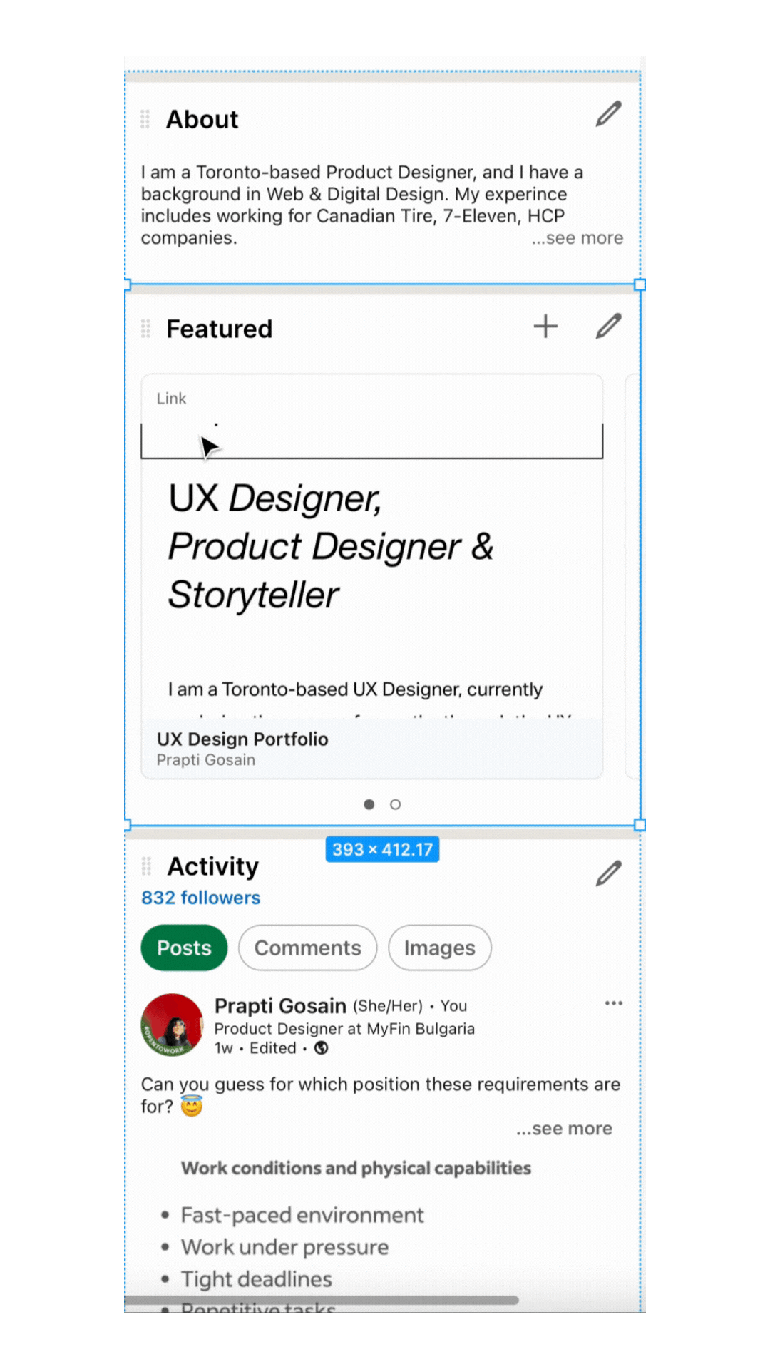
What the solution looks like in action.
Highlight your strongest skills, work or updates.
Adjust the sequence of the section putting your best foot in front.
Choose which information to display at the very top.
What Changed?
Fixed Stacked Sections (before)

Toggle to change the sequence of the sections ( After )

User Testing & applying feedback

The icon for the toggle wasn't my first choice! Initially, I used a hamburger menu to indicate that the sections are draggable. But the user mistook it for a collapse option,
Before Feedback
So I decided to change it to the circle's icon and adjusted the colour to be less inviting but still noticeable enough to interact with.
After Feedback
I did some Heursitics Evaluation and decided to make accessibility and cosmetic changes to the profile section.


Final Output

Measuring Success!
What do my testers think of this solution?
2
Users thought this was an actual feature. and asked me how to access that in the LinkedIn App.
2
Users strongly suggested that this should be an actual feature